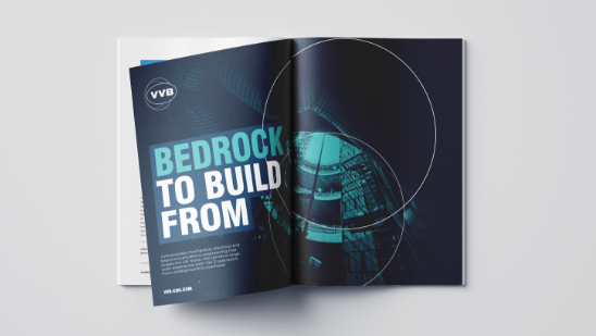
Overview
VVB uses an engineered, well-cut, classic 'Swiss 721' supported by a highly crafted digital typeface, 'Montserrat', making modern communication effective.
Links to typefaces here
Text pairings
Headlines
Swiss 721 Black Condensed
Swiss 721 Bold Condensed
Headlines use Swiss 721 in both forms. This is flexible but be mindful of consistency and text hierarchy.
Text
Montserrat, Medium
Montserrat, Regular
Montserrat, Light
Please don't use other typefaces with the VVB brand.
Text rules
There aren't that many, but there are a few rules that you must follow for consistent typography.
Kerning for
headlines

Optically Aligned
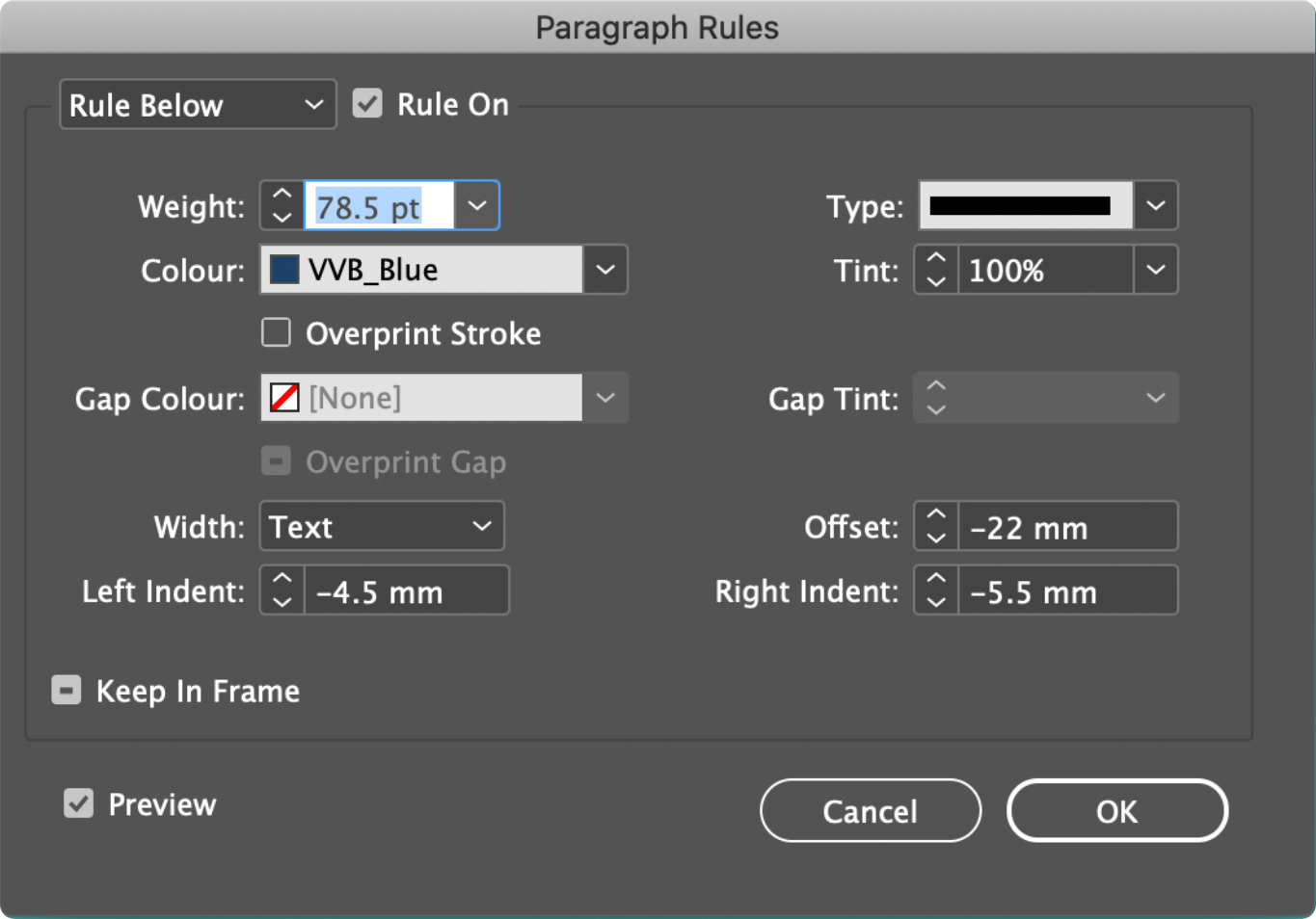
Kerning is the letter spacing between the individual letters, and it's important that it is set to -30 for all headlines to maintain consistency.
Please where possible maintain 'optically aligned' kerning, mainly selectable in print software like InDesign.
There will be instances where you can use more relaxed kerning, but only for smaller annotation labels etc.
Leading for
headlines

Leading is the line spacing and this is a bit more demanding, as there is no exact rule but it needs to be tight.

Kerning for
body copy

The kerning for Montserrat is set at '0'.
Optically aligned where possible.
Leading for
body copy

Leading is the line spacing and we use rules of four, so we +4 on any specific type size. This gives us nice control over vertical type spacing.

Label options
For headline and statement use ONLY, when you need a bit more punch. There's no real rule as to when you use this feature, only rules on how it is produced.

16px global padding main rule
16px is the amount of padding we use for label headlines universally.
If common sense rules 16px impossible, due to spacing, use a lower value of 8px.


For print applications follow these principles
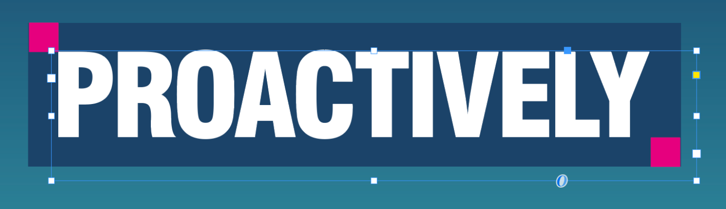
Draw a square unit that is 16px to use as markers, then apply a ruler that is offset and makes up the label. Once you have done this for one word, a rule is set for that specific type size - and you just type normally.
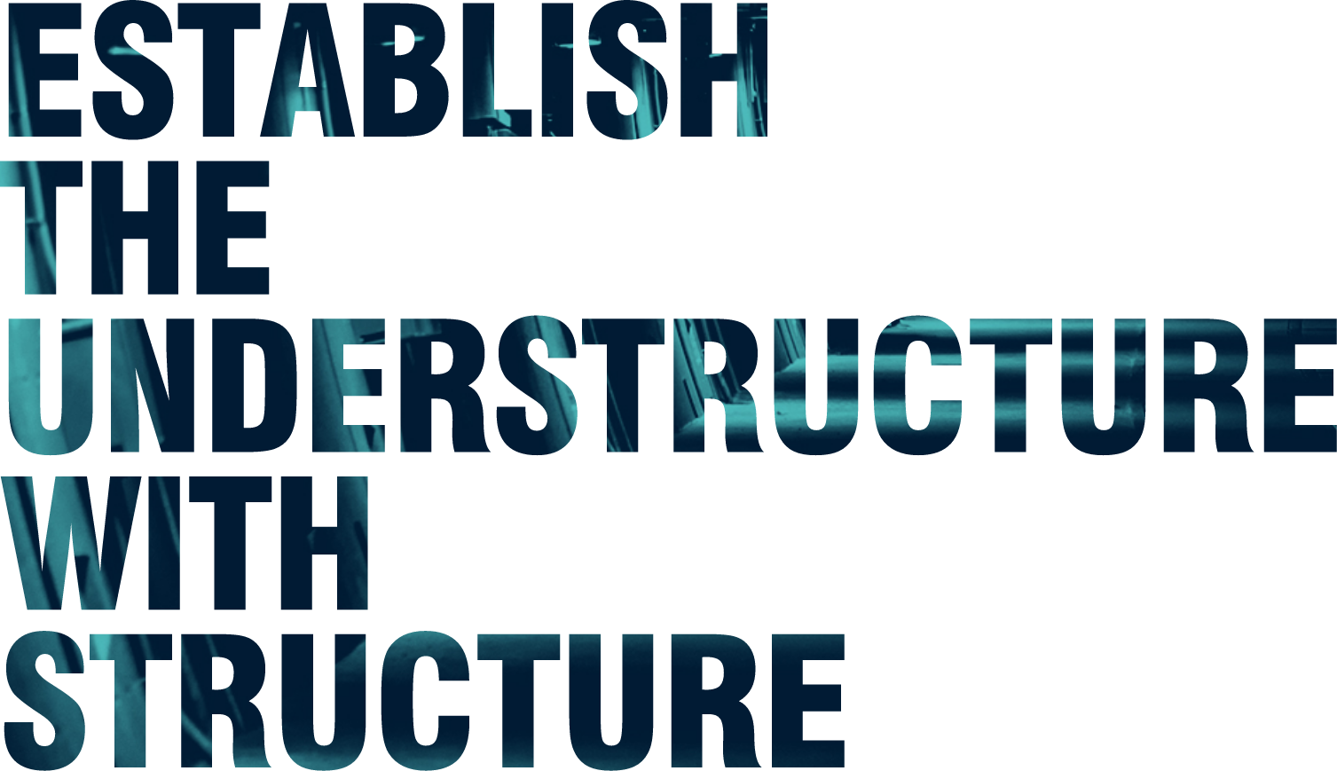
Vision text
For illustrative purposes only, and used sparingly, but this technique helps with adding depth and importance to specific text.
Text hierarchy
Text hierarchy tells the reader where to look first, and which information is most important. Consider what you want to say, and where.